In this quick tutorial we’re going to take a few datasets and build an interactive map that’s ready to share by link or embed on a website. No GIS platform, no code, no per-viewer licensing.
What you’re building
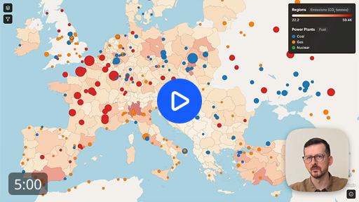
A map of European regions colored by CO2 emissions, with power plants on top. Each plant is colored by fuel type and sized by capacity. Viewers can toggle layers, filter by capacity and fuel type, and hover for tooltips.
Three files:
- A GeoPackage with Eurostat NUTS regions
- A CSV with emissions per region, joinable to the GeoPackage
- A CSV of power plants with coordinates, capacity, and fuel type
Download the datasets if you want to follow along.
Import the data
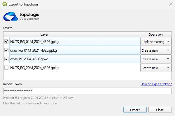
Drag the regions GeoPackage in and confirm. It becomes a new layer.
The emissions CSV has no geometry of its own. Instead of importing it as a separate thing, we want to enrich the regions layer by joining both datasets using a shared key. Topologis pauses the import and asks for a config, or a “recipe”. For Source Key and Target Key pick NUTS_2_code on the CSV and nuts_id on the GeoPackage and confirm. The CSV columns now sit on the regions as new fields.
The recipe step is there for a reason. Real CSVs rarely line up cleanly. Column names disagree, encodings vary, decimal characters switch between dot and comma. The recipe is where you settle those questions once. You can also save it and reuse it for the next file with the same shape.
The power plants CSV has coordinates, so drag it in, confirm the default config and it imports as a point layer.
Style the regions
Before we apply styles, we first need to move the power plants layer above regions so the points draw on top of the choropleth.
Then from the Style tab, create two styles, one per layer and assign them to the correct layer by right clicking and choosing Assign to Layer.
On the regions style, set the fill to be driven by the emissions field by clicking the Sigma icon next to the fill color. Pick a color ramp and the choropleth is done.
This is what’s called a numeric mapping. The values in the field have a natural order, so Topologis interpolates a color across the range. The other option is categorical mapping, where each distinct value gets its own color regardless of order. You’ll use it on the power plants in a second.
Style the power plants
For the power plants style, we apply the following settings:
- Color by fuel type. The field is detected as Categorical and you can pick a categorical scheme, instead of a ramp.
- Radius by capacity, from 2 to 20 pixels. Feel free to adjust the values, or add mid points.
- Opacity at 100%.
The explicit radius range matters. With a default range, a 10 MW plant and a 1,000 MW plant end up looking almost the same. Picking the min and max yourself is how you get the variation you actually want.
In this example we also drop the stroke opacity on both layers to around 10%.
Filters
Before we do the filters, start by renaming the layers in the Data tab to “Power Plants” and “Emissions” so they read well in the legend.
On Power Plants, enable the Capacity filter. The histogram is linear by default, and for this dataset that’s a problem. Most plants are small, a few are very large, so the small ones collapse into one tall bar and we can barely see the value distribution on the chart.
Switch the scale to logarithmic by clicking the Log button below it. Log scale is useful any time your values cover a wide range, where each step is a multiplier instead of a fixed amount. Income, population, file size, power output. Capacity in megawatts is exactly that shape.
In this example we trim the low end of the capacity range, and hide some of the fuel types. Later on we expose those filters as UI controls, so the viewer can still see the full dataset if needed.
Tooltips
With the layer selected, head over to the Tooltip tab in the layer details and enable capacity and fuel.
Capacity is in megawatts, but viewers see only a number without a unit of measurement. To fix that, open the field’s Advanced settings and add MW as a suffix.
We also want to have the name of the power plant as a title. Head over to the Tooltip in the main navigation bar. This tab contains all project-wide tooltip settings.
For the title, leave “Title Field” on Auto. Auto picks the first of name, title, id that exists on the layer. This dataset has name, so the plant name lands at the top of the tooltip with no extra setup.
Publish
The last step is deciding what the viewer can see and do.
Let viewers toggle the layers on and off, and let them adjust the filters you set up. These choices belong to the view, not the project. A view is a saved presentation of the project: which layers are visible, which filters are exposed, what the basemap looks like, where the camera starts. The same project can serve a public embed and a full-detail internal map at the same time, without duplicating any data. A different audience is a different view.
Start by creating a new View, then enable the layer and filter controls that you want your viewers to see.
The basemap can also be customized by removing features you don’t need, like boundaries and places.
In the Share tab you will find the link. Copy the link, send it to anyone. Whoever opens it sees the map you published, can use the controls you exposed, and doesn’t need a Topologis account.
The finished map
Wrapping up
That’s the full loop: take prepared geodata, style it, configure how viewers interact with it, publish a view, share or embed the link. The same project can power as many views as you need, each one tuned for a different audience.
This is what Topologis was built for.
Start building with Topologis
14-day free trial. No credit card required.

Nikolay Dyankov, Founder
